Design
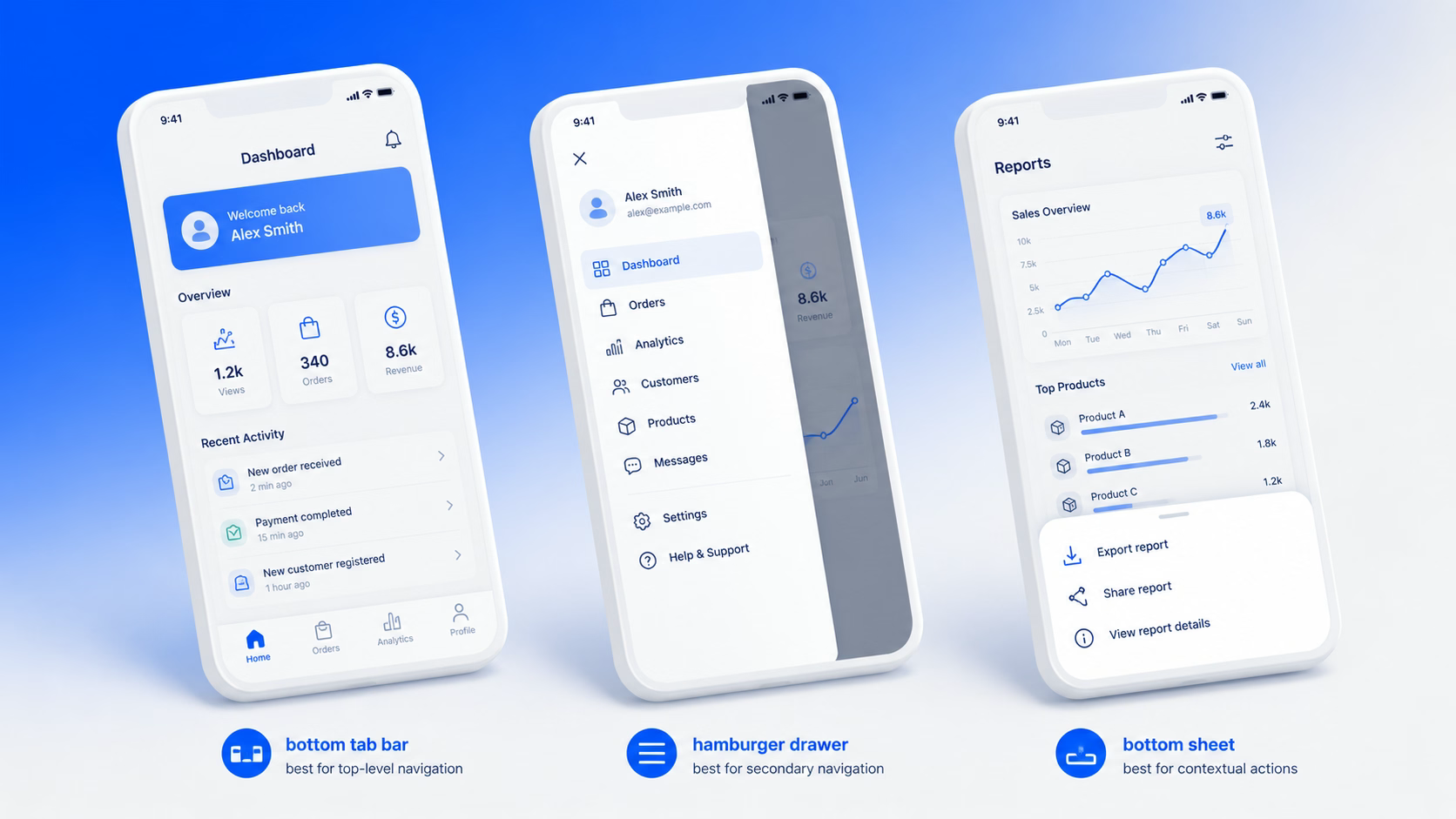
Mobile app navigation patterns: how to pick the right one (without guessing)
May 5, 2026
Most product teams ask us for a design system when what they actually need is a tighter style guide and a small pattern library. The terms design system vs style guide get used interchangeably, so by the time someone says “we need a design system,” they often mean six different things. Some want consistent buttons. Some want a Figma library. Some want governance. The result is a six-month project that solves the wrong problem.
In our experience running design system setup engagements for SaaS teams, the right starting point depends on your team size, product surface area, and how often your UI changes. We’ll walk through what each one is, where they overlap, and when investing in a full design system actually returns the time and money it costs.
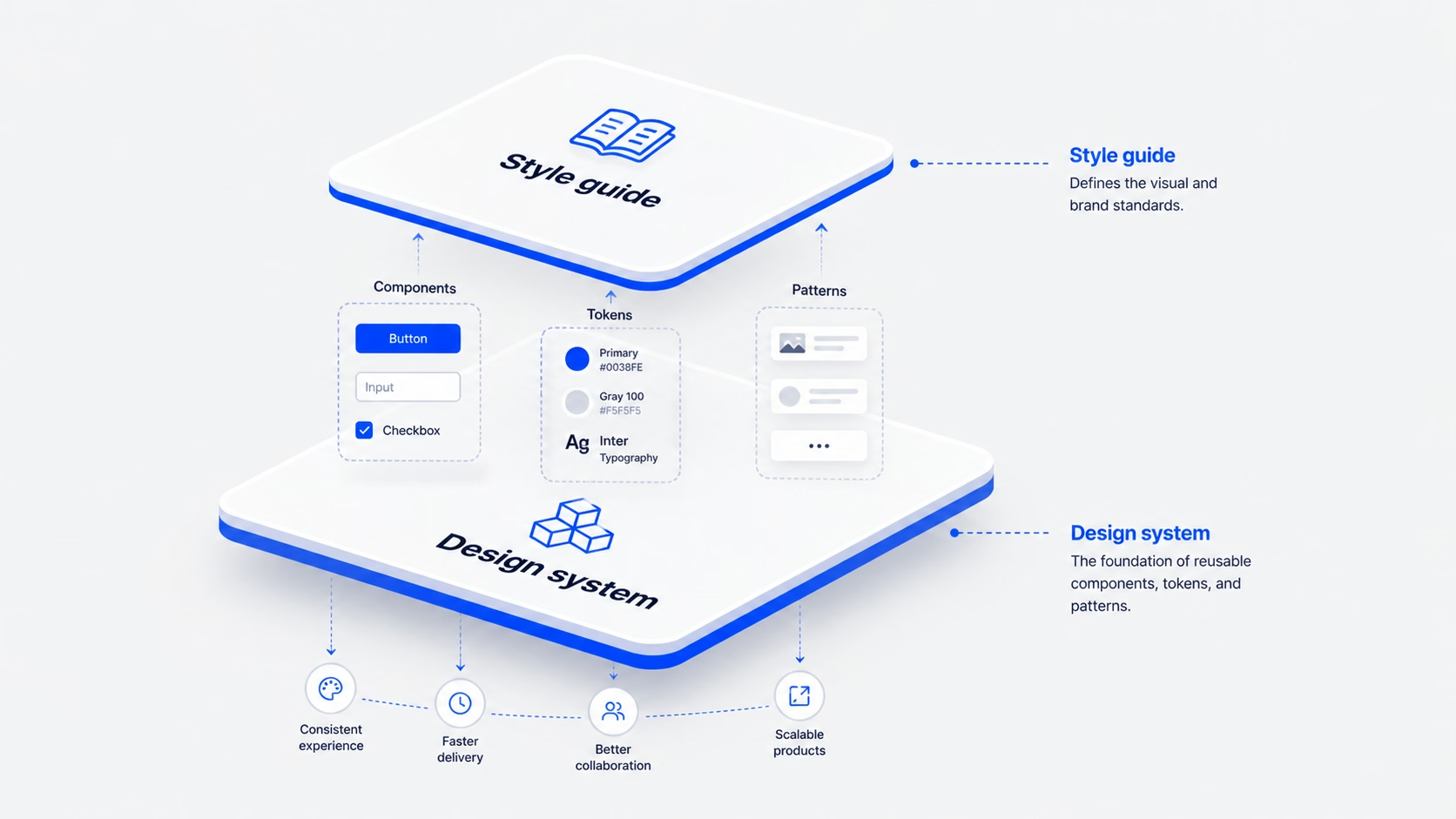
A style guide is documentation. It tells your team how the brand should look and sound when applied to a UI: colors, typography, spacing rules, logo usage, voice and tone, button styles. It is a reference, not a product. You read it. You don’t install it.
For most early-stage SaaS teams, the first useful artifact is a style guide. It locks down the visual language so designers stop debating shades of blue and developers stop guessing at padding. A good style guide includes:
What a style guide doesn’t cover: how a button behaves when it’s loading. How a modal stacks above a toast. How a date picker handles invalid input. Those are interaction patterns and component states. Style guides describe; they don’t ship.
IMAGE: design-system-vs-style-guide-section-1.png
ChatGPT prompt: Flat editorial illustration of an open style guide document showing color swatches, a type ramp, and spacing rules. Clean white background, minimal icons, accent blue (#0038FE) and warm orange star highlight (#F5A623), 16:9.
Alt text: Style guide document showing colors, typography and spacing rules
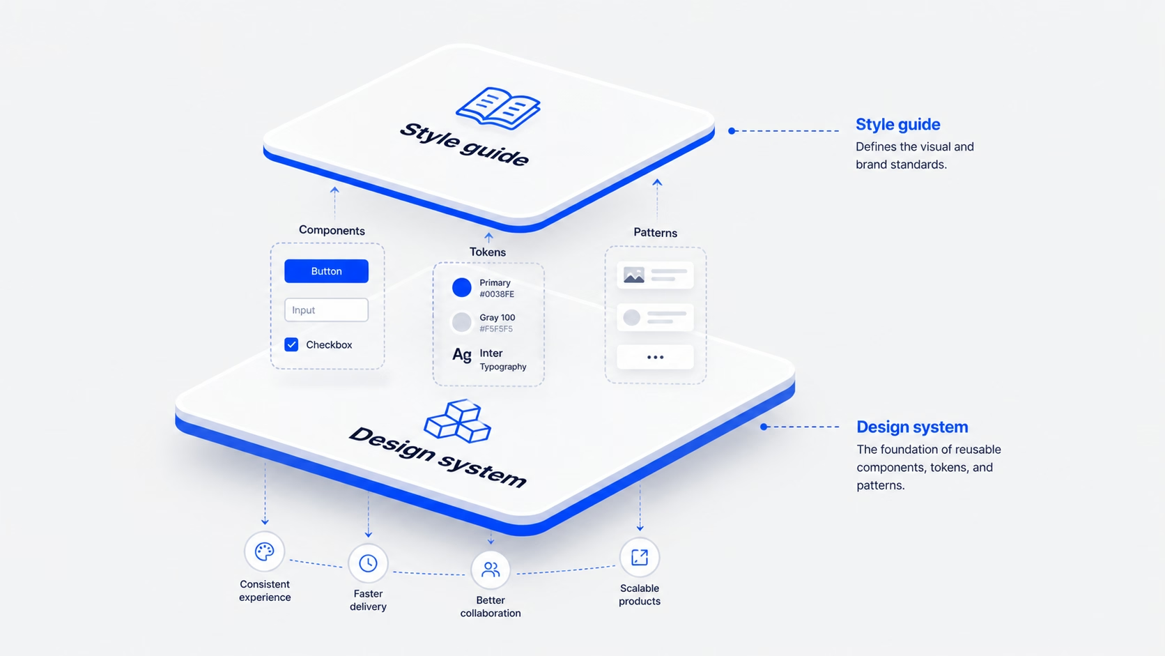
A design system is a product. It contains everything in a style guide, plus the working pieces of your UI: coded components, interaction patterns, accessibility rules, contribution guidelines, and a process for keeping it all in sync between Figma and your codebase.
A real design system has four layers, the same way our team structures every Design System Setup engagement: Tokens → Components → Patterns → Usage rules.
The difference is who uses it. A style guide is read by designers and content people. A design system is consumed by developers building features at speed. If your engineers can’t pull a <Button variant=”primary”> straight from a library and ship it, you don’t have a design system yet. You have a style guide with extra steps.
IMAGE: design-system-vs-style-guide-section-2.png
ChatGPT prompt: Diagram of a four-layer design system stack labeled Tokens, Components, Patterns, Usage rules, drawn as nested rounded rectangles. Minimal line style, accent blue (#0038FE) for the active layer, near-black (#171717) text on light grey (#F5F5F5) background, 16:9.
Alt text: Four-layer design system structure: tokens, components, patterns, usage rules
The cleanest way to think about it: a style guide is a document; a design system is a product. The Nielsen Norman Group makes the same call. A design system is the “parent” that contains the style guide as one of its children, alongside pattern and component libraries.
Three differences matter for product teams.
If you’re a five-person team with one app and one marketing site, you don’t need three of those layers yet. You need the first one.
IMAGE: design-system-vs-style-guide-section-3.png
ChatGPT prompt: Side-by-side comparison illustration. Left card titled “Style guide” with a document icon and a person reading. Right card titled “Design system” with a stack of UI components and a developer pulling code. Minimal flat style, accent blue (#0038FE), light grey background (#F5F5F5), 16:9.
Alt text: Side-by-side comparison of a style guide and a design system
We tell early-stage clients to start with a style guide and a small reusable component library, not a full design system. A style guide is enough when:
You’ve outgrown the style guide when:
That’s the inflection point. It’s usually 12 to 18 months into product development, around the time the team grows past 8 to 10 people. [HUMAN INPUT NEEDED: insert a specific 16pixel SaaS client example where this transition happened (e.g., RecurPost or Upmetrics) and what the trigger looked like.]
IMAGE: design-system-vs-style-guide-section-4.png
ChatGPT prompt: Editorial illustration of a small startup team (3 people) working at one screen on the left, and a larger product team (8+ people) on multiple surfaces (web, mobile, dashboard) on the right. Clean flat style, accent blue (#0038FE) highlights, light background, 16:9.
Alt text: Small team versus larger product team needing different design tooling
A design system is an investment, not an aesthetic upgrade. It pays back in three ways.
You should consider building one when you have multiple products or surfaces, distributed teams that ship in parallel, and a growth plan that involves more features without more inconsistency. If those three things aren’t true yet, a style guide plus a 10-component library will hold you for another year. For SaaS teams specifically, our work on SaaS UI/UX design usually starts with that lighter layer first.
IMAGE: design-system-vs-style-guide-section-5.png
ChatGPT prompt: Illustration of a balance scale weighing “design system investment” (stacked components, code icons) against “engineering speed and consistency gains” (clock, growth chart). Minimal flat style, accent blue (#0038FE), warm orange (#F5A623) for the gains, light grey background, 16:9.
Alt text: Balance scale showing design system investment versus speed and consistency gains
The mistake most teams make is treating the move as a “design system project,” a six-month rebuild with a separate budget and a separate team. We’ve found the cleaner path is incremental, following our Design System Setup flow: Tokens → Components → Patterns → Usage rules.
Most teams can run this over two quarters without freezing feature work. [HUMAN INPUT NEEDED: insert a 16pixel example of a phased design system rollout and the team size it was run with.]
IMAGE: design-system-vs-style-guide-section-6.png
ChatGPT prompt: Step-by-step roadmap illustration showing 5 milestones (Tokens, Components, Documentation, Patterns, Governance) along a curved path. Minimal line style, accent blue (#0038FE) markers, light background, 16:9.
Alt text: Five-step roadmap from style guide to a working design system
A few patterns we see across [HUMAN INPUT NEEDED: insert number of design system or style guide projects 16pixel has shipped]:
IMAGE: design-system-vs-style-guide-section-7.png
ChatGPT prompt: Five small flat illustrations arranged in a grid representing common mistakes: a half-built product, a Figma file alone, a fossilized component, a leaning tower of components, and a contractor working in isolation. Accent blue (#0038FE) and warm orange (#F5A623) highlights, light grey background (#F5F5F5), 16:9.
Alt text: Five common mistakes when choosing between a style guide and a design system
No. A UI kit is a collection of design files, usually in Figma, that designers can drag and drop. A design system includes the UI kit plus tokens, coded components, documentation, accessibility rules, and a process for keeping all of it in sync. A UI kit is one input into a design system, not the system itself.
We don’t recommend it. Even a one-page Notion document with your colors, type, and spacing rules saves hours every week and prevents the “everyone picks their own grey” problem. A lightweight style guide takes a day to write and removes a year of small disagreements.
For a single SaaS product, a working v1 (tokens, 10 to 12 components, basic documentation) takes about 6 to 8 weeks with one designer and one engineer working part-time. Patterns and governance add another quarter. A “full” design system across multiple products is usually 6 to 9 months of phased work, not a single project.
A small team, usually one designer, one engineer, and a product manager part-time. Without an owner, nobody fixes drift, and the system becomes another piece of internal documentation nobody reads. If you can’t name the owner, you’re not ready to build it yet.
A pattern library is a collection of reusable design solutions, like how a search-with-filters works or how an empty state behaves. It’s one layer inside a design system, the layer between individual components and full features. You can have a pattern library without a full design system, and many teams do.
For most early-stage products, yes. Tools like shadcn/ui, Radix, or Material, paired with your own tokens and a thin custom layer, get you 80% of the way without the cost of a custom system. Build your own only when your product has unique interaction needs that off-the-shelf systems can’t handle.
If you’re not sure whether your team needs a style guide, a small component library, or a full design system, the answer usually shows up in a 30-minute audit of your product surfaces and team size. We help SaaS teams scope the right level of investment so you don’t overbuild, and so what you build actually gets used.
If your inconsistency problem is rooted upstream of the system itself (in user flows or information architecture), a UX audit is the better starting point. Otherwise, talk to our team about a scoped engagement and we’ll help you pick the right shape for where your product is today.
jatin.creatrix@gmail.com
Design writer at 16pixel — a global UX and web design agency helping brands build world-class digital experiences.
Let's talk about your project and what 16pixel can do for you.
Book a Free Discovery Call