Design
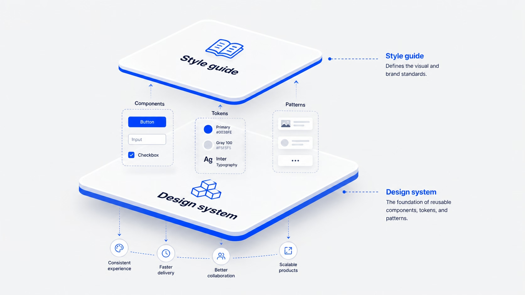
Design system vs style guide: what to build first (and why most teams overbuild)
Jun 5, 2026
The UI/UX design process is a structured, repeatable approach to creating digital products — websites, apps, and platforms — that are both usable and enjoyable. It’s how design teams move from a vague idea to a refined product experience.
Without a process, design becomes guesswork. Teams build features nobody asked for, ship interfaces that confuse users, and rework things three times before launch.
With a clear process, every decision has a reason. Every screen traces back to a user insight. Every iteration brings the product closer to something people actually want.
Key Insight: The UI/UX design process isn’t just for designers. Product managers, engineers, and founders all benefit — because great products are built by teams who think about users at every step.
These steps aren’t rigid. Real teams move back and forth. But they all happen — in some form — in every well-run product team.
Research is where the design process begins — and where most teams cut corners. They assume they know what users want, build something, and discover too late that they were wrong.
Good research isn’t just running a survey. It’s sitting with users, watching how they behave, and understanding the gap between what they say and what they actually do.
The goal is to reduce assumption and increase evidence. Every insight you gather becomes ammunition against bad design decisions later.
Common Mistake: Skipping research to save time usually results in building the wrong thing — then spending 3× more time fixing it. Research is not overhead. It’s insurance.
The Define phase is about making sense of what you discovered in research. You’ve collected a lot of data — now you need to find the signal in the noise.
This is where you create user personas, map customer journeys, and write problem statements. The goal is to align the whole team around a shared understanding of who you’re designing for and what problem you’re solving.
“A problem well-defined is a problem half-solved.”
Pro Tip: The best problem statements are specific about the user but open-ended about the solution. “How might we help busy parents track medication schedules without adding cognitive load?” — that’s a good one.
Ideation is where you generate possibilities — not where you pick one. The biggest mistake teams make here is committing to the first idea that sounds reasonable, which is almost always the most obvious one.
Good ideation is divergent before it’s convergent. Generate 20 ideas, explore 10, sketch 5, refine 2. By the time you start building, you’ve stress-tested your direction — and you know why your chosen solution is the right one.
Remember: The best ideas rarely come from the first session. They emerge after you’ve exhausted the obvious and you’re forced to reach further.
This is the phase most people picture when they think of “design.” But by this point, the hard thinking is already done. You know who you’re designing for, what problem you’re solving, and which direction you’re going.
Design and prototyping happens in stages — from rough sketches to polished interactive prototypes. You start low-fidelity to move fast, then increase fidelity as you gain confidence in your direction.
Tools of the Trade: Most design teams use Figma for wireframing, visual design, and prototyping. It’s collaborative, version-controlled, and integrates with developer handoff tools.
Testing is where assumptions meet reality. You put your design in front of real users, watch what happens, and let their behaviour — not their opinions — guide your next iteration.
The cycle doesn’t end at launch. The best product teams treat every release as a hypothesis, measure what happens, and continuously improve. Testing is not a phase — it’s a permanent posture.
“Test early, test often, and test with the people you’re designing for — not your colleagues.”
Companies that follow a structured design process ship better products, faster. Here’s what experienced teams know from practice.
UI and UX are often used interchangeably — but they refer to different things. Understanding the distinction helps teams structure their work and hire the right people.
UI Design focuses on the visual layer — colours, typography, buttons, layouts, and component design. It’s what the product looks like.
UX Design focuses on the overall experience — user research, information architecture, user flows, usability, and accessibility. It’s how the product works and feels.
In practice, the boundary is blurry. A UX designer who can’t think visually will produce flows that are logical but painful to use. A UI designer who doesn’t understand user behaviour will create things that look beautiful but don’t convert. The best product designers operate across both.
In a modern product team, design doesn’t happen at the start of a project and then hand off to engineering. It runs in parallel — continuously discovering, defining, designing, and testing while engineers are building.
This is often called continuous discovery. The team maintains a regular cadence of user research even while features are in active development. New insights feed directly into upcoming design work.
The design process is evolving. AI tools are changing how designers work — not by replacing them, but by automating the repetitive parts and accelerating the exploratory ones.
The fundamentals, however, don’t change. Understanding users. Defining problems clearly. Generating and testing ideas. The process was never about which tools you use — it was always about the thinking behind the work.
UI design focuses on the visual layer — colours, typography, buttons, and layouts. UX design focuses on the overall experience — user research, flows, usability, and the journey a user takes. Both are needed for great products.
It depends on scope. A small feature might go from research to prototype in a week. A new product from scratch might take two to four months before something is ready to ship. The process is iterative — you don’t stop designing after launch.
Yes — especially startups. Early-stage teams are often tempted to skip research and just build. But the cost of building the wrong thing is highest when you have limited runway. Even lightweight research (5 user interviews, a few usability sessions) dramatically reduces waste.
Figma is the industry standard for UI design and prototyping. For research, teams use Maze, UserTesting, and Hotjar. Notion or Confluence for documentation. Jira or Linear for tracking design work.
You can, but you shouldn’t. Teams that skip research almost always spend more time on rework after launch than teams who invest upfront. Even 4–5 user interviews before you start designing will surface assumptions you didn’t know you had.
Define success metrics before you design, not after. Metrics like task completion rate, time on task, conversion rate, and user satisfaction scores (NPS, CSAT) tell you whether your design is achieving its goals.
At 16pixel, we apply this exact process to help SaaS teams and founders build products their users love. Book a free discovery call to get started.
jatin.creatrix@gmail.com
Design writer at 16pixel — a global UX and web design agency helping brands build world-class digital experiences.
Let's talk about your project and what 16pixel can do for you.
Book a Free Discovery Call